Q: What type of file format should I use? Jpeg or Tif?
A: The best file format would be tif, file format like jpeg compress the picture’s color and pixel resolution and this can cause color shifts and blurriness. Unlike the format tif, it preserve the color and sharpness of your pictures by not compressing it, which on the other hand has its down side, for example images in tif format is bigger in term of bytes compare with the jpeg format, thus taking up more storage spaces.
Just for your information, the compression process removes all of the colours that are not visible to the human eyes. A good example would be an image of sun set captures with a digital camera and saved in RAW mode or Tiff format, the image contains ultra-colours not are visible to the human eyes. Compressing the image removes these invisible colours.
If it is not visible, then why do people still uses Tiff or RAW format when taking pictures? Well, these invisible colours are visible to other species like cats and dogs, who knows they might be conducting some experiment with the animals, or studying the atmosphere of certain planets.
Q: What Dpi settings should I use when composing my presentation boards / 3ds perspective?
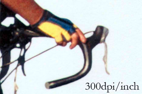
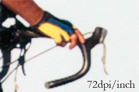
A: The default dpi for a computer monitor is 72dpi/inch which is sharp enough displaying images on the screen. But then when it comes to compiling your presentation boards, to make out the best of it you should use 300dpi/inch as your default settings in photoshop. Why 300dpi/inch and not 100 or 150dpi/inch? Well, most printer are optimize to print resolution of 300-600dpi/inch at its best, it would be a waste not to harness the maximum permormance of the printer.
The image below is a side by side example I printed using my office hp laserjet 5550 on normal plain paper, with the setting of 72dpi/inch and 300dpi/inch each on an A4 size layout for both. Scanned with Canon Lide35. If you have a super fast comp, then by all means use 600dpi/inch.
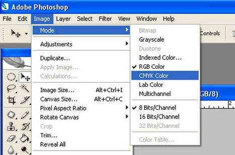
Q: What colour scheme should I use? RGB or CMYK?
RGB is the normal color scheme used in computer graphics, while CMYK is the standard for printing color images. Because the computer screen displays light, the more colors that are added, the more light is added, thus the lighter your resulting color. Because the CMYK color scheme is used in combining inks, the more colors you combine, the darker your resulting color.
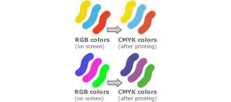
You most likely won’t notice this kind of color shift in a color photograph. It is more likely to happen if you pick a very rich, vibrant color for a background or some other element of your layout. It probably won’t look bad, it just won’t look exactly the same. But it may not be noticeable at all either. In any event it will look spectacular compared to a piece printed on an inkjet printer.
The best solution is to use the CMYK colour as the default settings. Using RGB colour and then convert it to CMYK colour for printing is a bad move, due to the fact that conversion from RGB to CMYK then to lose some colour data that might effect the final output of the image.