After getting a series of hate mails from die-hard-architecture fans and not to mention archi-maniac on my previous post – What is Architecture? Once again, what is architecture? Is it a form of art? and architects are into architecture because of the money? passion? a civic duty to uplift mankind?
It is wrong to generalize all architects are money minded, or crave for awards, but I’ve come to notice that most architects has one thing in common – archi-masturbating, not all but a majority of them.
You see, Alvaro Siza is a great architect, his creative use of spaces, and cleaver use of light illuminate the space with a soft ambiance, it is hard to ignore that his buildings blends seamlessly with the surroundings, but what I don’t understand is the long narrow corridor, why walled it up? so that the space is dark and by punching a small hole he gets to create this cool idea of light coming in?
Anyway, what James Howard Kunstler tried to highlight in his talk show is the over-creativity of architects, yes, too much creativity kills the brain cells Public spaces should be inspired centers of civic life — the physical manifestation of the common good. Instead, he argues, what they have in America is a nation of places not worth caring about.
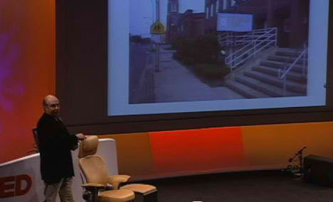
James Howard Kunstler highlighted that architects love to play with levels, elevate the ground for no apparent reason, thus making it disable unfriendly in the name of creativity.
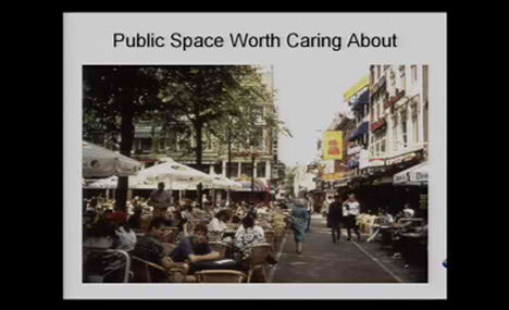
A flat open walkway would be good enough, having different levels or some weird looking shop front does not guarantee the popularity of a space. The success of a space lies in density, typical European cities like Paris is a good example of density at its best.
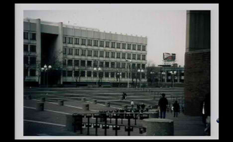
Boston city hall plaza, creative? Yes. Is it successful? No, is it that hard for architects, businessman and the local council to take a step back? we have the solution thousand of years ago, why not built upon these ideas? Enhance it, innovate it. Without density, there would be only failures and suburbia is problem, not solution.
Most architects are blinded by the money, blinded by the awards.
Ludwig Mies van der Rohe was right, less is more, less is sexy! Elevated ground? Wide open plaza with different levels? Is that is not archi-masturbating? I’ve always believed in keeping things simple, and hated the idea of elevated plaza, elevated ground and all those bells and whistles.
Watch the interview, it is really funny!


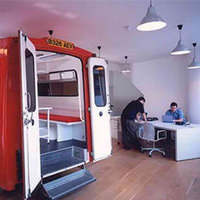

we make money ??!!
where ?!
i thought we worked for peanuts…