Besides line weight mistakes in a presentation boards, the other most common mistake would be the perspective view. Having said that most of us make simple mistake in our perspective view, include below is one good example of a bad perspective view with errors. What is the mistake? Do figure it out before scrolling down for answers.
It’s the eye level and size perspective that is wrong. Size perspective refers to apparent reduction in size of an object over distance. This can be said when two objects of the same size appear different in size when placed far apart, the larger one will seems to be nearer while the smaller as further away.
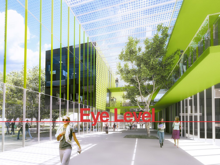
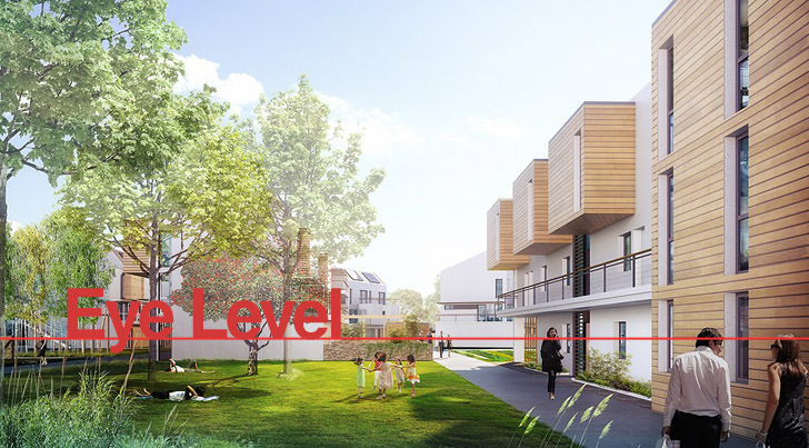
A very good example would be when we observe a crowd of people. Naturally we perceive all of them have the same height and proportion. In linear perspective, the head of people will appear to be approximately at our eye level if they are standing or walking on the same horizontal plane as the one we are standing.
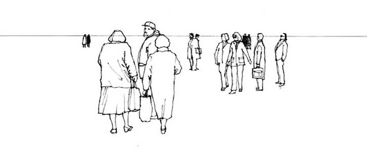
When it comes to inserting human figure in a perspective view, remember to draw a line or drag a guiding line from the ruler to the desire location in Photoshop. This can be done by simply enable the ruler function in Photoshop, by clicking on the “view” tab and then select “ruler”, or press ctrl+r for the hotkey.
Drag a horizontal line from the ruler and adjust the human figure to be with the same eye level with the other for the right perspective view, example shown below.



Hi,
I am trying to download 3d models from your site and can’t get any link? Is there way I can login?
Very nice and helpful figures. Naturally it will benefit so many who are using this site. Thank you very much.
Jyothi Prakash
Hello,
I’m a slow learner. And, onething I don’t quiet get it from ur post.
That is,
u’ve mentioned that the first image is wrong.
And, u’ve shown the last, properly edited version.
But,what’s the difference between the first image and the last image??