I prefer the term less able over disable, here are some really creative stairs for the less fortunate people. It is more of the idea of both using the same structure instead of having a separate ramp at some remote corner, as if these less fortunate people are not worthy of entering the building.
Tony Hawk and his skateboard approves this design!
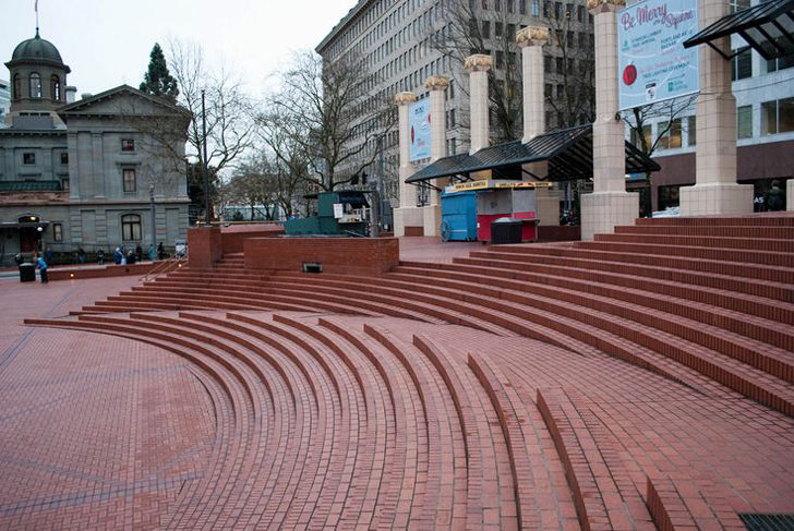
Pioneer Courthouse Square | Portland, U.S.A.
Photograph by Cory Silva
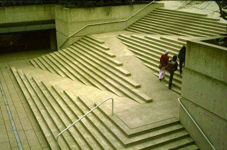
Robson Square | Vancouver, Canada
Photograph by Howard Davis
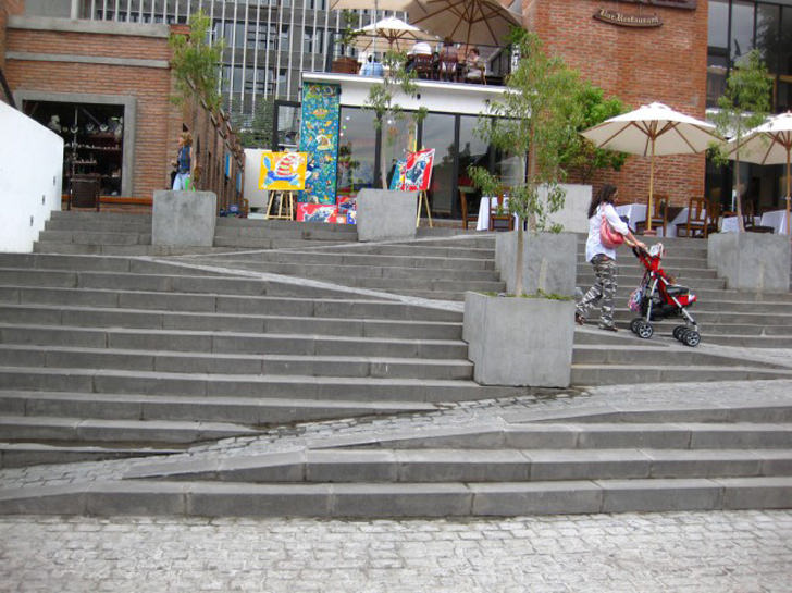
Stair Ramp Combination | Santiago, Chile
Photograph by Beau Lebens
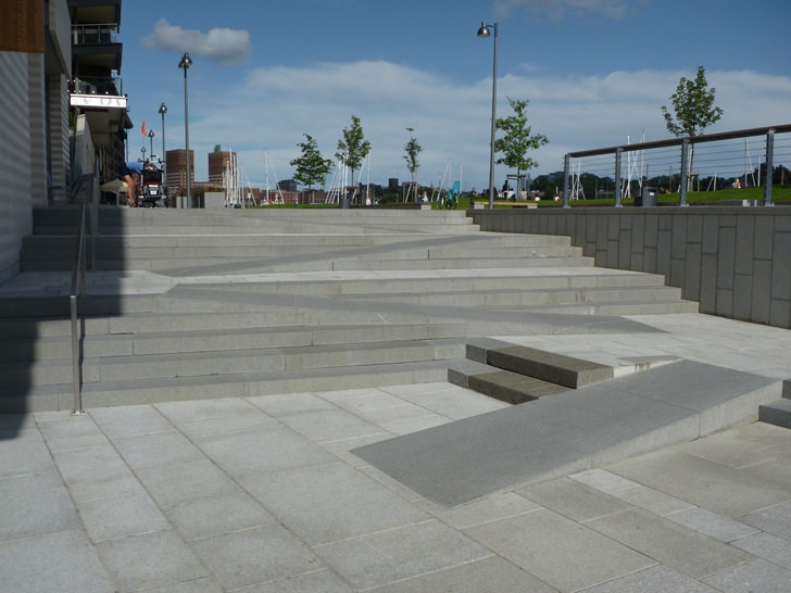
Public Park in Tjuvholmen | Oslo, Norway
Photograph by Kristian Hoff Andersen
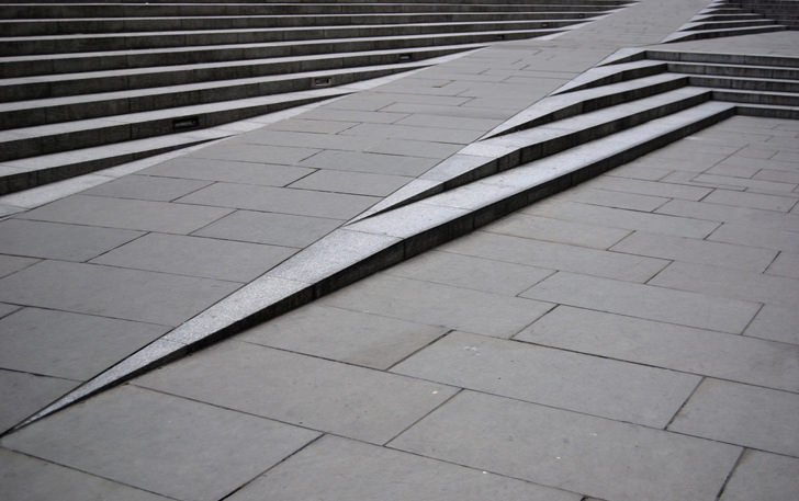
Blackfriars Road | London, England
Photograph by Alvin Pastrana


Good point on the disabled label.
Those ramps are cool, but I worry would they meet ADA codes here in the U.S.?
I think they do, or else, it won’t be approved.
my concern is that those ramps don’t look “soooooo”but they are no support rails on those ramps, can;t it pose a danger?
Yeah, the missing rails. Maybe the sloop is 2 times smaller than the safety requirement? These local councils approved the design, I believe it must have met the safety requirements.
The distance handicap has to travel to reach the top is much longer than for others. I think the design looks cool, but not that useful.
hmm… it has always been longer in term of distance. If it is the same, they might as well just build a ramp with the same gradient like the steps instead of having a special ‘side ramp’. Maybe for such specially designed ramps they are longer than average, but it puts them on the same page as the able person, instead of having to use a ‘side ramp’ that nobody but the disabled use
Being a wheelchair user, I want to chime in about these PRETTY LOOKING, but failing designs.
When they are pictured as shown, empty of all activity on them these staircase ramp systems look to be the answer for some many people.
Now, when they are used in real world events, and real life is at work, they start to fail. For one thing they must be super well lit at night time. Those hundreds of little stairs that line the edges of the ramp off excellent tripping hazards.
As people use the stairs, and you have disabled people, or baby buggies, and such the two types of traffic will end up crashing into each other. Not just once maybe a few times or more.
As these systems get heavy use the disabled people are forced to sit on the ramp until a hole in the walking traffic opens up… Only it is not that simple. The entire RAMP in the event of a FIRE or emergency would be blocked by people walking up and or down them… EPIC FAIL to provide TWO separate options for people to use.
In effect this is going to cause more headaches and trouble than a staircase by itself, and a ramp as stand alone. Thus both forms of traffic would be then truly able to move at the most effective speeds, and not have one form block the other.
YES these overpriced wastes of money on PRETTY architecture LOOK GOOD….
But the ramps lack hand rails, separate traffic pathways for safety, and from my view of these may not offer enough light at night time to be able to see the tripping issues caused by the very design of the combo stair ramp idea.
I say KEEP IT SIMPLE. No need to try to combine the slow and fast lane of a freeway into one lane. See how that won’t work?
No handrails, tactile surface indicators, contrasting non-slip stair nosing, – wont meet required standards in many countries… just sayin’
Wouldn’t handrails block the stairs? That would be the failure of design. This is a happy compromise, so great work. And looks good too (rare for ramps).
I see the compliance brigade has been out in force in the comments. Sad lives lived in ugliness.
Love the examples.
but who are ramps primarily designed for then, if compliance is to be ignored? If compliance is ignored, then this title should not contain anything that references the less-able users.
The compromise is designing something both aesthetically pleasing and functional.
Otherwise this is just something to look at, for use by able bodied people only.
This can completely be done in the US. Koolhaas addition to the IIT Mccormick Campus center does this and is basically the exact same thing as the Vancouver and Santiago stairs.
The life lived in ugliness is the one that ignores the concerns of the people these designs are supposed to accommodate. I have never heard from a person with mobility issues who likes these designs. They are pretty, as many on here say. They are not functional; they merely give the appearance of functionality.