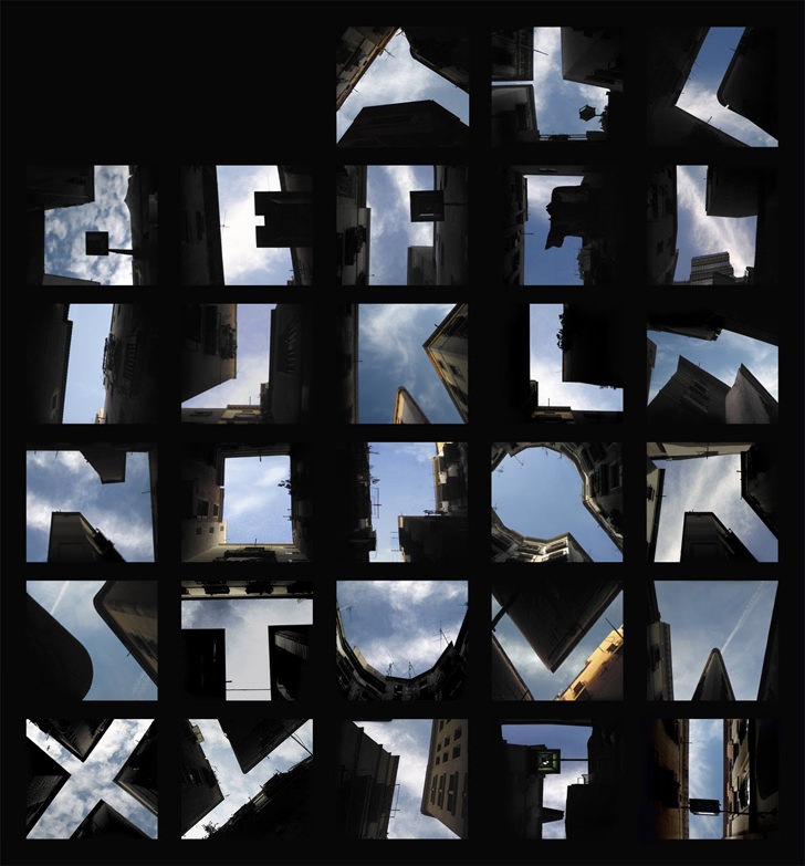
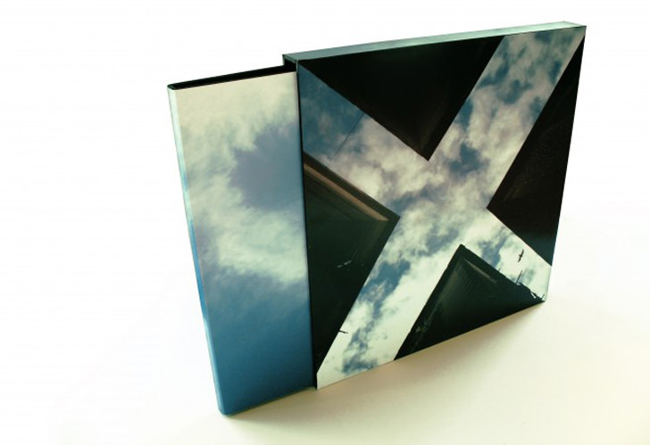
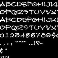
Sported at Designboom and Deezeen, here is a font created Lisa Rienermann while studying at the University of Duisburg-Essen, the alphabet is formed of the shapes of buildings against the sky when photographed.
[Complete List of Architectural Fonts Here]
This unique font is specially created for those that eat and breath architecture, it is highly recommended that all students should use it in their architecture presentation board in order to score an A in their design.
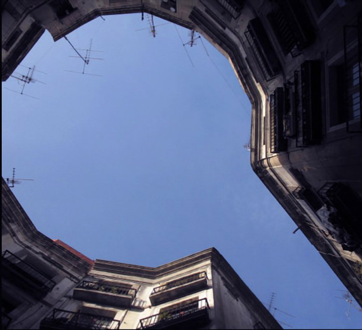
“It began with the Q,” she tells Slanted. “I was in a kind of courtyard in Barcelona. I looked upward and saw houses, the blue sky and clouds. The more I looked, I saw that the houses formed a letter Q.”
For more information, visit Deezen.
Talk about fonts, I manage to download the Helvetica font days ago, two words to describe this font – simply beautiful. 2007 marks the fiftieth anniversary of Max Miedinger and Edouard Hoffmann’s design Helvetica, the most ubiquitous of all typefaces. According to source, Helvetica is the most widely used typeface in our twentieth century.
Very creative,great idea-my congratulations.Definitely,Lisa ist he fontmaster.