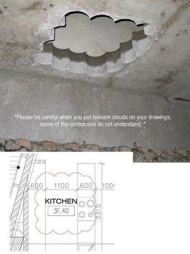
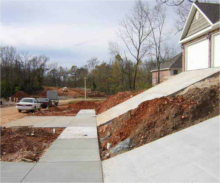
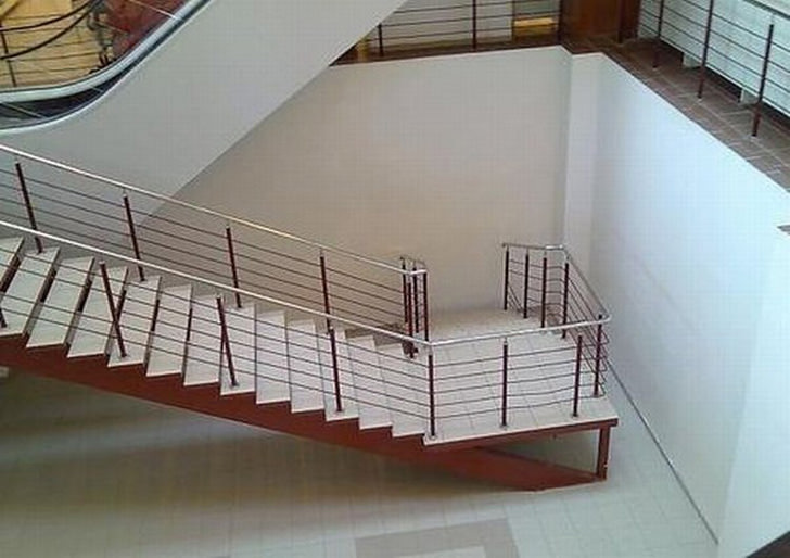
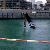
Not quite what I had in mind, here is a blog that has some really interesting collection of construction mistakes, only a handful of them are technical errors. The image below is definitely the mother of all construction error, can you imagine the amount of effort wasted?
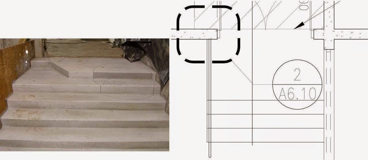
Sometimes, it is us human with our arrogant attitude and the resistance towards technology that causes all these unnecessary construction mistakes, gone are those days where the only colour available for drawing are black and blue, isn’t it time we introduce some colours into the technical drawings? Let’s say we separate the lines into two categories, one for the building outline and another colour for specifications/arrows/highlights or denotes.

nice and funny
These are really funny. Hope you put up a few more.
Haha stupid applying pic
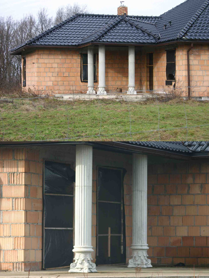
I didn’t realise corinthian columns would look so good upside down!
It depends on where you’re from. Australia Down Under? Haha, joking.
And i didnt realise that the corinthian columns would look so good, so close to the wall/door.