“All art is erotic.” – Adolph Loos. We humans are profoundly sexual creatures. But, are our buildings sexual, too? So, you thought your Victorian cottage has the feminine looks and the castle in your country has the Masculine touch.
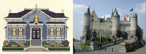
Great architecture touches the soul and lifts the spirit. Does it also stir our physical beings? Just like a human being, a tall building is more pleasant towards the eye and mind compare with a short and fat building in term of dimension, and undeniably that a tall building with a good facade treatment and unique shape tend to be sexier than a building with four flat facades extruded from the plan till the roof. Take a look at the images below, which is sexiest among all? Definately not the second building from the left.
Santiago Calatrava knows all about architecture and how to spice things up. The Turning Torso (image below) is a very good example of how a building should look like – sexy. Makes me wonder if the sex-ism concept exits.
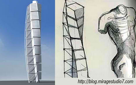
This reminds me of Hugh Ferriss, High Priest of the New York Skyscraper Sex Cult. Hugh Ferriss (1889 – 1962) was an American delineator (one who creates perspective drawings of buildings) and architect. According to Daniel Okrent, Ferriss never designed a single noteworthy building.

Huge Ferris design resemble the phallus, and it is a symbol of power, a display of might. Reason being is that the soviet union and united states are at the height of the cold war and both tried to out do each other in sports, technology, science and not to mention architecture by building tall monument like structure that seems to exist only in fairytales.
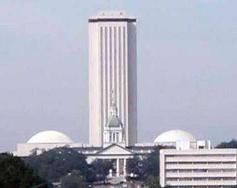
…Only in fairytales? I guess not. Take a look at Florida State’s capital building (correct me if I am wrong). It has been voted as the most phallic building in the world.
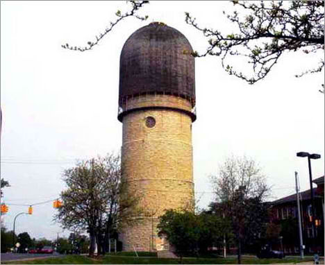
Runner up would be The watertower of Ypsilanti, Michigan! (image below) Called “the brick dick” by locals, this building is clearly the world’s most phallic.
Okay, enough about the art created by the artist. Now, how about architects themselves? Are they sexy? According to research, architects have been voted the sexiest male professionals in a survey of women’s ideal partners.
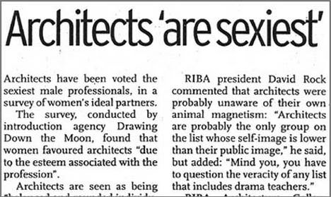
Architects are sexiest. What’s wrong with being sexy? Architects have been voted the sexiest male professionals in a survey of women’s ideal partners.
The survey, conducted by the introduction agency Drawing Down the Moon, found that women favoured architects “due to the esteem associated with the profession”.
Architects are seen as being “balanced and rounded individuals who combine a creative approach with a caring, thoughtful disposition”, the survey found. It concluded: “Their ability to cope with pressure of work in a relaxed manner was also deemed to be a significant plus.”
Male architects beat stockbrokers, doctors, film directors and teachers on the top spot. However female members of the profession fared less well and did not feature in the top 10 out of male preferences. RIBA president David Rock commented that architects were probably unaware of their animal magnetism: “Architects were probably the only group on the list whose self-image is lower than their public image”, he said, but added: “Mind you, you have to question the veracity of any list that includes drama teachers”.
RIBA Architecture Gallery director Alicia Pivaro, who is married to architect Paul Monaghan, said she thaugt male architects were highly attractive: “Being married to the architecture’s Mr Sexy, I would have to agree.”
But she was surprised at the failiure of women architects to appear on the list. “All the ones I know are very sexy”, she said. Men instead voted PR executives the sexiest profession for females, followed by actresses and journalists.
I guess architects are indeed sexy, hmm… are your lecturers sexy? Perhaps the right question would be is your boss sexy? hmm…. found this undated photograph of Mies Van de Rohe presenting his work with a female companion as a … .. as a… well, I have no idea why she is there but is she there to spice up the model or she is the lead designer?
Is Mies’s work sexy? Yes, I think so, for all its transparency it uses light and reflection to change and slowly unfold the space. The best of the buildings elicit a response like that the architect himself had on Dr. Farnsworth at their first meeting: “The effect was tremendous, like a storm, a flood or other act of God.” His interior spaces are legendary. They change with the time of day and the season. The shiny, reflective metals, the rich leathers, the tactile fabrics, the reflections from the glass radiate luxury and a Weimar noblesse and seductiveness. The polished metal curves of his Brno or Barcelona chairs have a sexiness about them. They beckon your touch. The one phrase that can be credited to him alone is “almost nothing.”
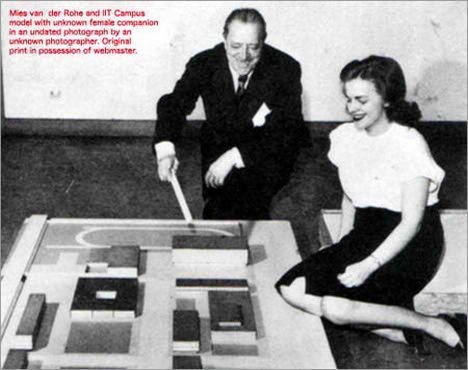
If Mies van de Rohe’s masterpieces are sexy then I guess his famous quote is sexy too.
“Less is more”
Like all design, there are bound to be amendments and I would love to amend his quote from “less is more” to “less is sexy”.
Back to the phallic topic again. Certain buildings resemble a phallic for a particular reason, but then a logo that resembles the phallic? and the best part is that its an architect firm – Ladies and gentlemen, young and old, children of all ages – I present to you- Dick Busch Architects’s logo:

Dick Busch Architects, based in Chesterfield, Missouri, has developed a reputation as being one of the premier architectural firms in the country. You will find, through our process, that we work closely with you to obtain an intimate understanding of your desires and thus are able to custom design a plan to completely fulfill your needs.
Can this be real? Any contacts? If you can’t get enough of the cock logo, then visit B3TA for the list of best Cock Logo, and if you are looking for a book, do read the sex of architecture.
Images Source and Articles Quoted From:
archidose
MakeArchitecture
Blowhards




hmm… the Nebraska State Capital building… THE PENIS IN THE PRARIE!
You could try adding the Lucerne tower by the bridge too :) We thought it was pretty phallic when we saw it.
What about Koolhaas’ CCT Tower, Bejing or Peter Eisenman’s project for the Max Reinhart Baus, Berlin—the concept of intervaginated phallic forms? I find C.H. Townsend’s rounded towers, like the Horniman Free museum pretty erotic, not to mention the Bishopsgate Institute. Nothing is sexier than a rough entrance portal properly approached, like Richardson in his prime.
Have you seen the REN, by Byork Ingels? that’s a real sexy craftwork. You should also try seeing some of Greg Lynn’s architecture.
Any survey that says male architects are sexy then I’m all for it. Good work.
yes!! feel so sexy!!
however, i do believe that there are some limits……….. check out the Luqa monument in Malta…….
i like sexy buildings because i feel that every buildings shouldn’t always be in one way like straight line .
This women’s hostel (in India) is shaped like a vagina on aerial view with a ruptured hymen and a large clitoris….
http://wikimapia.org/#lang=en&lat=15.883813&lon=74.515165&z=18&m=b&v=1
one pervert of an architect…
This is so embarrassing to recall….but in my junior fall quarter studio, I chose to turn my squatty hill-hugging “grotto” into the tallest tower in sight. The program gave us a hilly tree-less barren landscape and we were to design a gathering place. It still doesn’t make sense to me today. But after drawing all night, putting yellow trace paper together to fit the 6o’?? tower at 1/4″ scale it never occurred to me how it might look- that is until I pinned it up for the next morning’s critique. In retrospect, I’m only surprised that Professors Ben Gianni and Ken Lee were able to keep from rolling on the floor with laughter. Talk about a phallic symbol….! At least it was a beautiful one!
pleas any one help me
i want to know what is norman foster concept and what is his logo shape
please iwant to know pleas please
emmmm…hey there was a survey says that i’m the sexiest of them alllll…. n my grandpa mies falls into two..
I have brought it to the attention of both students AND professors at my school that using the word “sexy” to describe aesthetic or formal characteristics of buildings/structures is completely wrong. In a profession traditionally dominated by males, the terminology has evolved for describing buildings that are either slender, smooth textured, serpentine, curvaceous, or exhibiting a modern/trendy color scheme, etc, etc.
Architecture is as much written and spoken poetry as it is spatial and visual. It relies heavily on verbal articulation for criticism, development and communication of ideas/concepts. Whole buldings have begun as concepts inspired from works of literature. (including some of my own designs) I find it completely appalling that all these valid adjectives have been bunched together into “Sexy”, when what the (usually) male architect really means is “That shit looks like a hot bitch”. The term is mostly used lately as slang and has been abused too much. Sexy can be used to describe architecture, but only when the concept, or structure clearly illustrates that it was derived from sex.
By the way, I’m not a feminist chick. I’m just a dude who takes his shit very seriously sometimes.
Hey fellow designer / architect….
Interesting blog you got, i will be around more often….
architect is the most difficult profession.ones who wants to build buildings CORRECTLY firstly must be PIOUS.
https://upload.wikimedia.org/wikipedia/commons/e/ed/Teufelsberg_ehem_Radaranlage.jpg