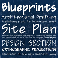
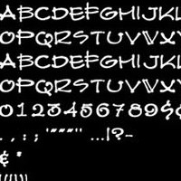
There is a new unique handwriting style of Architects font for those interested in creating a more ‘sketch’ like presentation – Prov Architect NDP (USD20). Check out my previous articles on Architecture and Fonts.

I purchased the font and found it useful on titles of the drawings, not so much on the text. There is a reason why some fonts are meant for titles and some are meant for full paragraph of texts. Check out this infographic on the difference between Serf and San fonts. That is why Times New Roman is the preferred text in most books.


