[ Updated ] Architectural font intended for use in technical drawings, presumably with Google Sketchup 7 and the hand-drawn strokes feature. Now, everyone can write like an architect! More architecture fonts:

Woolkarth-Bold Bold Font (Free)

Flux Architect (Free)

Architect Bold by Australian Type Foundry ($25)

Graphite Light by Adobe ($26)

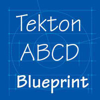
Tekton Pro Regular by Francis D.K. Ching ($25.99)

Urban Sketch (Free)

Stylus BT (Free)

TwoByFour Regular ($19)

Frank the Architect (USD20)

Architect Font by Hank Gillette (Free)

Schema Light (Blueprint) ($19)

TK Architect (Free)

Architect NDP ($20)

Modular Stencil (French drafting stencils) by Le Corbusier ($178)

Rough Draft (USD30)

Tecon ($20)

Damned Architect (Free)

Draft Hand ($15)

Architect Small Block ($20)

Prov Architect NDP ($20)

Architect’s Daughter (Free)

DRAFTSMAN (Free)
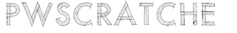
PWScratched (Free)
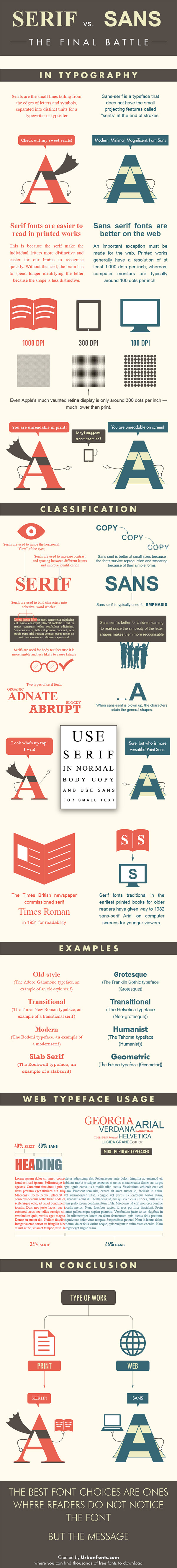
Serif vs Sans
Which type of font is better? The best font choice are the one where readers do not notice the font, but the message. Serif fonts are easier to read in printed works, this should be your primary choice.
Need of fonts and study materials
now how do I get these fonts for free from here?
I guess we don’t
oh! for the FLUX http://www.fontsy.com/font_details_3641.html
I am getting a book on manual drafting published. I have used romans.shx in CAD and Calibri in WORD for my illustrations. My editor has seen Archstyl.shx, city blueprint and country blueprint and want me to use one of these more hand-drawn looking fonts. Before I go to the expense of downloading one of them, I would like to see a sample of them first. Would it be possible for you to e-mail me a sample of these fonts. Perferably in all caps and large print (equal to 24″ in publishing print or 12″ in CAD.
Your site is wonderful. It is the only site hat gives samples of some fonts!!1 Thank you so much.
Great debate, though I always use the sans font. Its good on web and in print I just have to convert them to an object or a shape to make it show well on prints.
Very useful and enjoyable. Thanks.
Nice posting.
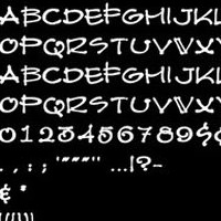
It would be nice if the samples included a line of numbers. (0123456789)
This is particularly useful for architectural drafting.
Very nice fonts, thanks for sharing.
Smart and instructive, also beautifully illustrated. Nice Job ;)
I love these fonts samples
It’s really use full to every architect.
well i was curious about architectural style hand lettering.
yes the internet can help sometimes.
i reviewed your information about handwriting.
and your lettering SUCKS too
the examples that are shown are from where or what country
obviously not from the USA.
if a candidate presented these styles he may not get a job
in my arch firm.
i believe that the skill and practice for arch lettering
is the mark of a true architect because lettering shows
the attention for detail that starts with your hand.
i have been complimented many times for my great PRINTING.
Yes i do use all capitals.
nowdays it seems that no arch tyles and never artist can
write in a professional manner. they just scribble some letters.
It is total bad taste. And since everyone uses the computer,
the lettering is done by the computer. the typical font is
CITY BLUEPRINT. It is very good but not prefect.
yes it is not perfect. your examples show a pentel pen
or felt point instrument. It is not the best. But it is the
most useable writing tool. I guess FLUX and DRAFTSMAN FONTS
are the best but still not perfect.
CITY BLUEPRINT autocad is very good. But your styles miss
many letters forms and technique. W is the worst. M are a clue. the
outer vertical strokes are VERTICAL not slanting.
Most beginning or entry arch jobs are doing construction drawings.
That will lead to detailing. That is the real test for hand lettering.
I do not need any guidelines or t-square to make perfect lettering.
and that is with a PENCIL. The techniques is a chised tip and hold
the pencil position to stroke all verticals with the edge of the chised
tip and flat side for all horizontal strokes. now that is THE MASTER.
Yes i am a master architect and artist. And when I handwrite anything
it is always noticed and commented. If you cannot use your HAND
for lettering, you will get nothing else to do. Your sketches will
probably worse. I guess they are trying to be doctors scripts style.
but you cannot read that shit.
byron keener 50 years art and design
COOLBYRON fb BYRON KEENER COOLBTRON linked-in