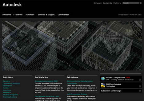
It has been ages since I last went to Autodesk’s website, seems like they’ve change the overall layout especially the colour from blue to black, the new layout was revealed one week ago! Out with the blue and in with the black! I have to admit that this new layout is a big improvement over the old layout in term of design, it has this professional touch to it.
AutoCAD Architecture 2008 is here, that’s right, AutoCAD 2008 is now available in both 32 bit and 64 bit. Should you upgrade to the latest AutoCAD? my advice is don’t bother, every year they release a new version with minor improvement, the biggest improvement is the cosmetic of the packaging and user interface.
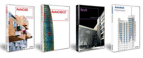
Autodesk Impression on the other hand is a must have product, I’ve yet to download the trial version but I bet this is gonna be the next must have software in every architecture firm. If you’re still not sure what Autodesk Impression is? Watch the movie.

