Concept in architecture should be abstract, the theme or idea should not derive from a physical object. Selling an architecture idea that was extruded from a existing object is a wrong move, I have to admit that famous architects tend to do this due to the sellable idea to the broader public. Iconography is a cancer in the architecture world.
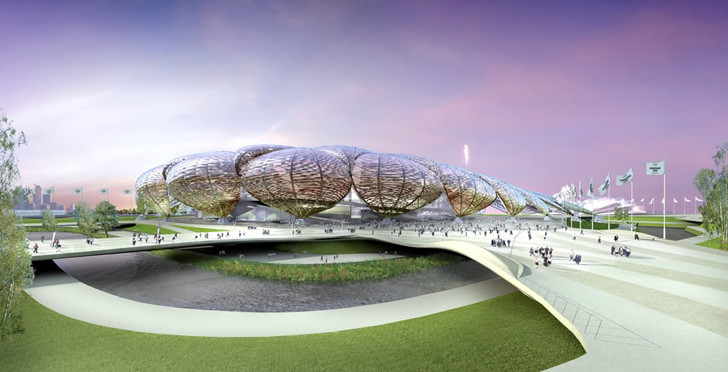
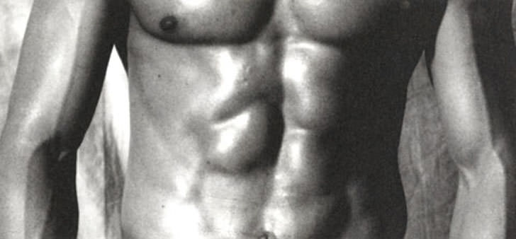
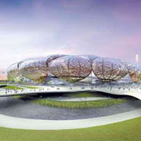
The use of iconography in the projects of FOA is defined by Alejandro Zaero-Polo as ‘form with a double agenda’. The image/iconography that is being used both conceptually structures the organization of the building, and is useful in the communication of the project to the public. The London 2012 Olympic Stadium proposed by FOA uses the iconography of the muscle:
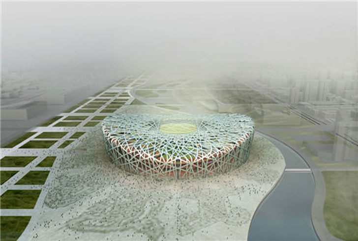
The Beijing 2008 Olympic Stadium designed by Herzog & de Meuron derive from the birdsnest concept, the name of the stadium is Beijing Olympic Stadium, but due to the concept, the public tend to refer to is as the birdnest, which goes to show that how powerful Iconography is in masking the art / idea in architecture. Just for your information, the Beijing Olympic Stadium has been re-design.

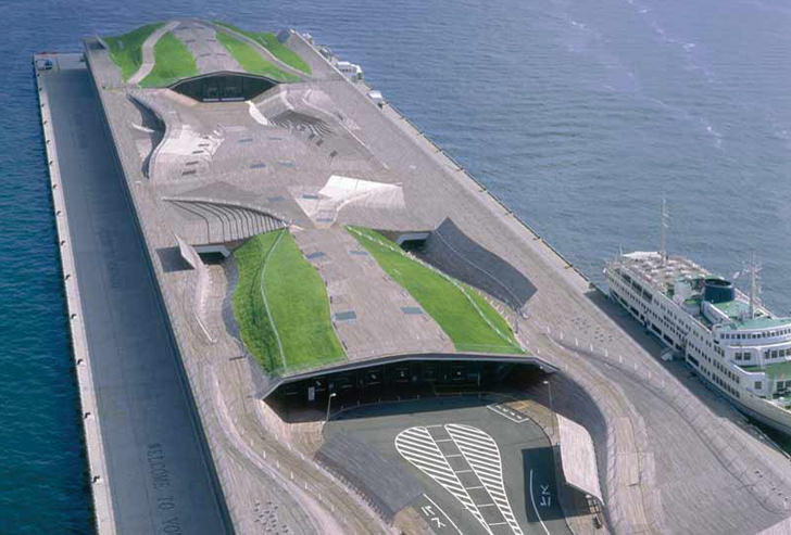
The Yokohama Cruise Terminal and the Hokusai Wave:

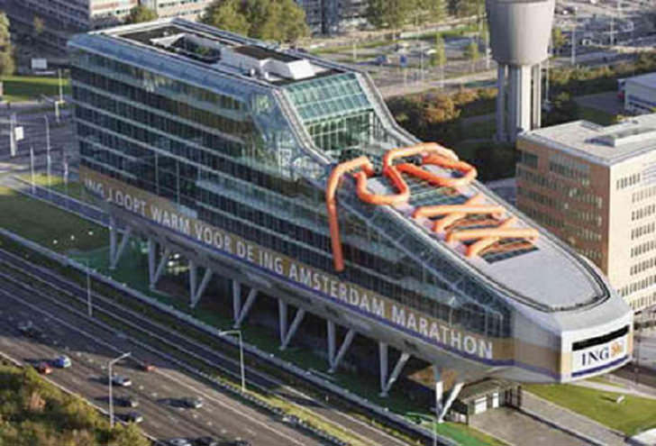
The ING House in Amsterdam of the Dutch architects Meyer & Van Schooten must the worst architecture ever in the world, I bet a first year student can come up with something much more interesting. The building resembles a shoe or a ice skating shoe. Come on, what is wrong with them, they’re architects, not product designer and definately not a shoe designer like Jimmy Choo.
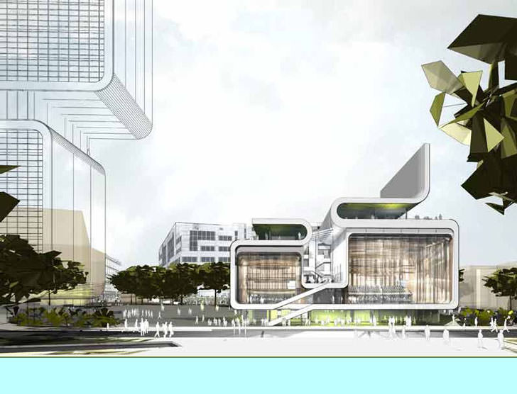
The design for the BBC Music Center by Foreign Office Architects uses the iconography of a folded filmstrip. Talk about music, the building seems to rhyme with the Nokia 7260 fashion line design, and what a coincidence that both has a music touch to it.

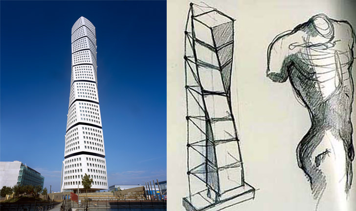
Santiago Calatrava’s Turning Torso building’s unique design consist of nice cubes twisting towards the waterfront and surrounding. The concept is a man’s figure.
Design is all about ideas and it doesn’t matter if the end products take the shape of a man or an object, it is how well one can persuade their listeners to agree with them.
For further reading : Michielangelo


Architecture has used iconography throughout history, but I don’t see it as ‘form with a double agenda’. I see it as a form with a deepr meaning. If you think about the reference to Plato in the Renaissance painting, Stanza della Segnatura then I think this reference really allowed the public to start to think for themselves. For example, would they believe in what Plato had to say about us being on earth by accident and that all good things would be in heaven in contrast to Aristotle,earthly views. The painting was not only beautiful but it also had a deeper meaning which inspired people to think. Regards, Annuska van der Pol, Victoria Boogie Woogie.
It has something to do on how would the designer will consider the functions of his structure to its users, Iconography should not be an issue since a designer should create an image or form which will not only affect the inner taste of people who will see his works but it should answer the solution on proper space management for a proper functional approach,It has always something to do with the architect’s life experiences.
Anyway, nice Blog,regards, Ronald Butaran, Philippines
concept can be abstract, of course…but not necessarily it SHOULD NOT BE derived from a physical object…i just think it came out wrong…when we bring out sth creative from a simple, could be really simple physical object…then it is called concept…so concept itself IS abstract…it’s just how effectively you can put things together…
Our first glance could be our illusion but whole movement of architecture is running towards this illusion “Good at first glance “,today”s so called modern movement ,hi-tech….etc are concentrated towards only game of glance.
“Design is all about ideas … it is how well one can persuade their listeners to agree with them.”
The idea isn’t strictly used for the purpose of persuasion, it’s also used as a form of motivation. Could you imagine living your entire life as a constant bitch to client demands (which most architects unfortunately do); or an idea can push you forward because you get to connect something much deeper than making an aesthetic building.
The idea is more for the architect, than it really is for the client.
It appears the shoe-ness of the ING building is temporary – the orange laces being inflatable props meant to highlight the resemblance to a sneaker, in connection with the advertised marathon.
From ground level, it looks more like a cruise ship in drydock.
I was thinking the sentence of “Concept in architecture should be abstract, the theme or idea should not derive from a physical object.” is not really true.
Ya, the concept in architecture should be abstract to attract people’s intention but the theme or idea can be derive from a physical actually. The physical object and the physical setting in the site as well. We should not think to create something that is iconic or “alien” to shown how power idea we have. We should remember building is for people, understanding the needs of the user is more important. The building form can be derive from the space or function – form follow function.
That is no right or wrong in architecture just like the argument of “form follow function” or “function follow form”. We should balance up both thing.
This is the first time i read this blog. This is a nice blog. I like it.
Iconography is nearly inescapable. The invention of form is influenced by, of course necessity, but even moreso by your experiences…the things you see, the dreams you have…people, nature, objects, motion. You can try to derive buildings out of silly notions like formulas and site/sight lines…but in the end they look like or remind us of something else.
Show me any building, and I’ll tell you that it looks like something else. Show me any object, and I’ll tell you that it looks like another person, place, or thing.
FWIW…if FOA was trying to elicit “muscle” iconography with that first building…they sorely missed their mark. Looks like a crawfish.
very very very impressive thats creativity empirical expresion
the thing here is, architecture revolves around everything, designers have their different means of conceiving their ideas and applying it to form. i would like to address that iconography should be inherent in every building because it dictates what story a building has. i believe that architecture is a communicative art, therefore it must have something to say about itself, it must not end up as an architecture that is left to be mute.
I always thought that the Yokohama Cruise Terminal looks like a dissected frog. But I haven’t found anyone to agree with me yet :P Nice blog! especially the architecture + humour part! Keep up the good work.
Iconography, sometimes is not the main agenda of an architect in design, it could actually be an outcome based on the public’s perception of the architecture. I do not find anything wrong in this.
What i do observe is that architects use iconography to drive the architecture design to achieve shock value and awe.
But then again that’s one of the main reasons we practice architecture, now do we. I do not say its the only reason, but it’s one of the reasons.